Newest data show U.S. still plagued by extreme residential segregation
May 20, 2021 — Detailed data from the 2020 census won’t be coming out until later in the year, but we have assembled a sobering picture of extreme segregation based on the latest detailed data that are available: the 2019 5-year American Community Survey (2015-2019). Powered by Social Explorer, the maps allow exploration at the state, county, census tract, and census block group levels.
Using each of three maps, it is easy to see the extremes of segregation that continue to plague the country. As explained by Craig Gurian, Anti-Discrimination Center’s executive director, “There has never been the political will to attack residential segregation in a sustained and aggressive way. As such — even though the lines of segregation have certainly softened since 1968 — there is still a remarkable amount of extreme segregation that still exists.”
Map & Data Resources
NOTE: These custom maps are best viewed on a desktop, laptop, or tablet: we recommend that you save your smart phone for other things. If you insist on using your smart phone, use it in portrait mode (though, even this way, some users have reported issues).
“Even today, despite the rhetoric of the Biden administration, it is not at all clear that HUD is ready to chart the direction that is needed,” he continued. “Obviously, the new HUD is a big improvement of the HUD of the Trump years, but I have gotten no indication that the new HUD is prepared to hold Westchester to account for its years of failing to comply with the core requirements of the landmark 2009 housing desegregation consent decree that resulted from our challenging Westchester’s false claims to have affirmatively furthered fair housing. Recognizing and redressing the previous failures of enforcement in that case is really a litmus test for whether HUD is actually ready to walk-the-walk.”
The African American Map
The first map focuses on areas of very low and very high concentrations of the Black population to illustrate patterns of segregation. By providing color-coding of the Black percentage of the population at each level of geography where that percentage is under 1, 2, or 3 percent at the low end, and 50 percent or more on the high end (the rest of the map is shown in gray), the user is able to see just how much of the country has an extremely low percentage of Blacks, and those areas where, in contrast, the Black percentage of the population is disproportionately high.
The Latino or Hispanic Map
The Latino or Hispanic map (the seond map) is organized in exactly the same way as the African American map except that the percentage groupings at the low end are under 3, 5, or 7 percent.
Be sure to zoom in and look at different geographies. In many cases, the true picture does not begin to come into focus until you are down to the census tract or census block group level.
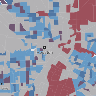
The “WHICH” Map
The third map is a “WHICH” map, where the color that is coded for the level of geography selected corresponds to the group that makes up the largest percentage of that geography. The stronger a group’s domination of a geography, the more vivid and intense the color. As shown in the maps, there are many vivid and intense areas of domination.
Compare different years, groups, and geographies with the interactive maps
Users are able to switch between and among the three maps, and between a “Census 2010” view and an “ACS 2019” view. As noted, maps can be set to show state, county, census tract, or census block group levels. Selections can be changed at any time. Hover over or tap any area to get the specific data about that state, county, census tract, or census block group.
Instructions for using the maps
- Choose a map by making your selection at the bottom of the screen. You can switch back and forth at any time.
- Switch between 2010 Census data and 2019 5-year American Community Survey data by making a selection at the upper right window above the maps.
- Find a specific location by clicking on the search icon to enter addresses, place names, counties, and postal codes. Caution: Sometimes what you might expect to be a Census “place” is not. For example, the place in New York City that you know as “Brooklyn” is “Kings County” for Census place purposes. Typing in “Brooklyn, NY” brings you to a different place entirely. If you are looking for a Census address, on the other hand (like “2021 East 41st Street, Brooklyn, NY”), you will wind up where you want to be.
- Alternatively, you can move the map with mouse or your fingers, and then zoom in or out using the plus and minus buttons at the upper right of the map or by scrolling with your mouse. You can also use your fingers. Clicking home brings you back to the initial map view.
- Try selecting a particular percentage portion for a demographic group in the legend at the lower right of the map, and see what “light ups” on the map.
- To get data about a particular geography, either hover over the area with a pointer, or tap with your finger on a mobile device. The data will pop up.
Go anywhere in the country
As further explained in the instructions, you can search for Census geographies down to specific addresses (though the map is coded only down to the census block group level). There are also a variety of ways to move and zoom the maps.
Making and using your own maps
Our republishing option is NOT available for embedding these interactive maps. You are welcome, however, to take screen shots of maps you create and publish them, so long as you attribute them to Anti-Discrimination Center and link back either to this page or to our Twitter account. Reporters and editors: we are happy to work with you to create images of relevant geographies and to discuss the extreme segregation that is found. Feel free to DM @antibiaslaw on Twitter, use our media contact form, or call area code 212, 537-5824, extension 1.
Notes for users
These maps are designed to show extremes of segregation. The color-coding on the African American and Latino maps does not by any means encompass all of what demographers generally consider to be “high” levels of residential segregation.
These maps rely on Census Bureau tabulations of the latest 5-year American Community Survey (2015-2019) and the 2010 Decennial Census, both available at www.census.gov. The ACS, since it is a sample, is subject to some sampling error.
Census geographies with fewer than 100 people are grayed out intead of color-coded because displaying a range for such areas might be visually misleading. However, if you hover over such an area you can see what data the Census Bureau has available for such geographies.